Mackenzie
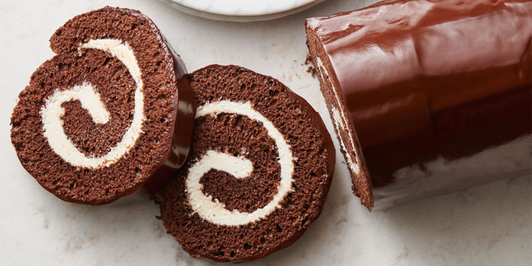
Mackenzie – a brand of confectionery – approached us when they were starting out, to create their logo and identity. The brief was simple, they needed to stand out in grocery stores and supermarkets in the confectionery aisle, while communicating an accessible price point.

The Logo
The logo was designed to communicate a light and sweet disposition . This wasn’t a sinful treat, but a sweet treat – plain and simple. The halo on the type helped communicate this, while the script style typography gave it a sense of accessibility.
The Identity
Designed to pop out from the shelves, while maintaining a contemporary aesthetic in the face of competition, the packs were designed in pop colours, with traditional cut-outs of product so the customer knows what to expect inside.
