PedalBeat
The only thing that makes our heart beat faster than a branding project, is, well, CARDIO! So when PedalBeat approached us to rebrand the logo for their chain of spin studios , we put in the (stationary) miles and the time to create an identity that was slick and sporty all at once.
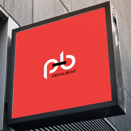
The Logo
With a demographic that ranged from young working professionals to seniors, the logo was created to cut through the demographics in its simplicity – an icon form of a bike.
The Identity
The identity was built with a strong focus on copy, and typography that placed function first. Simple, straightforward – much like getting on an exercise bike to get a workout.
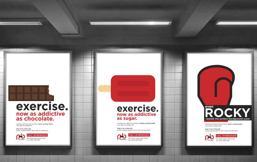
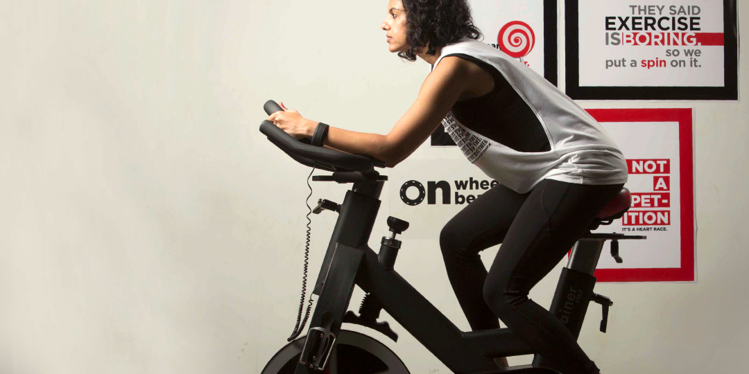
The Campaign
Campaigns were designed and articulated to introduce spinning as a workout that was truly addictive. The chain’s focus on developing playlists that kept the music experience fresh was also a strong hook.