The Table
When a little dessert jar branding was put on the table, we were excited about more than just the free samples. Puns aside, we have always been fans of Chef Shriram Rajendran – a published cookbook author – for his range and quality in dessert-making. Shriram’s forte lay in the ability to conjure up recipes that were crowd-favourites, as well as experimental.
The Logo
When we created the identity we played with the form of a circle to communicate a sense of non-fuss inclusivity that dessert jars provided. And in terms of product portfolio, the circle to us also represented his versatility with desserts.
The Premium Range
The chef’s penchant for playing with liqueurs and premium alcohols was extremely evident in this range. Sold at a higher price point and made in special batches to be sold as part of restaurants’ menus, this range was basically art.
The Best-Sellers
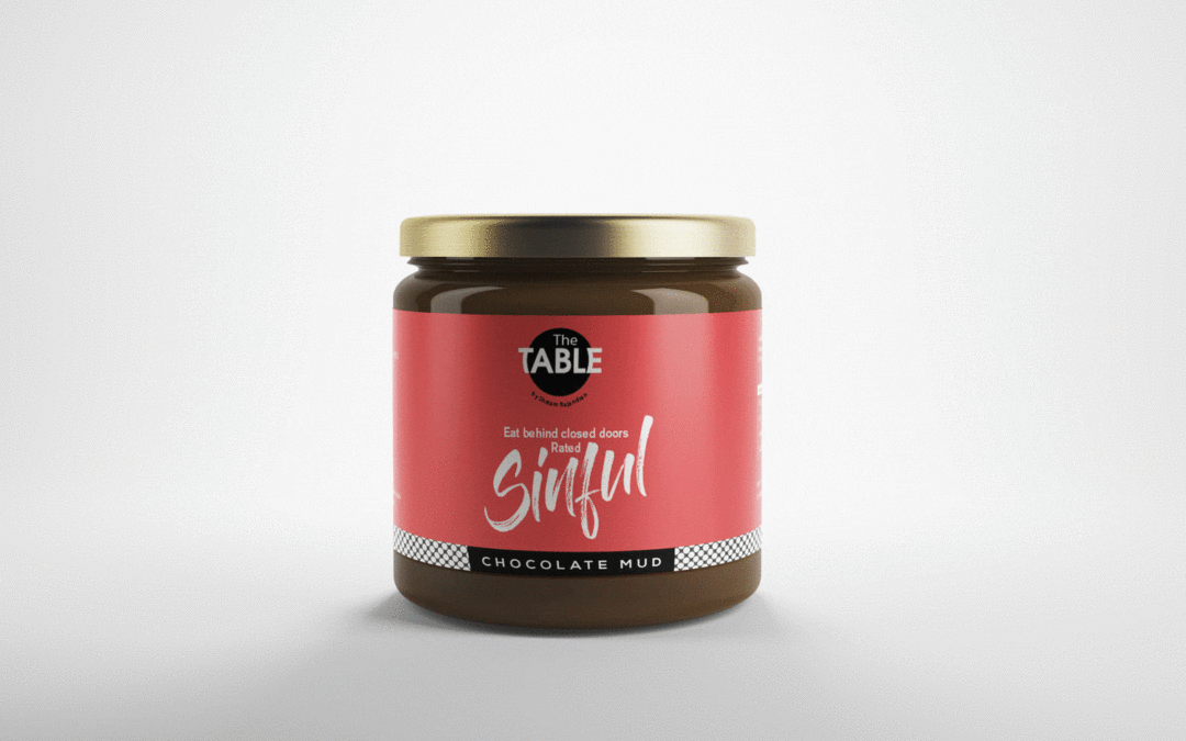
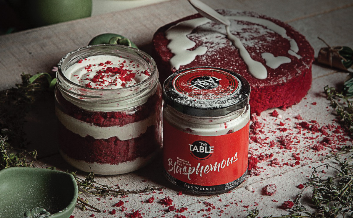
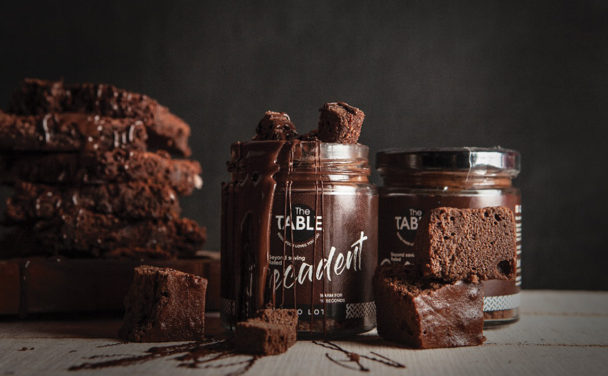
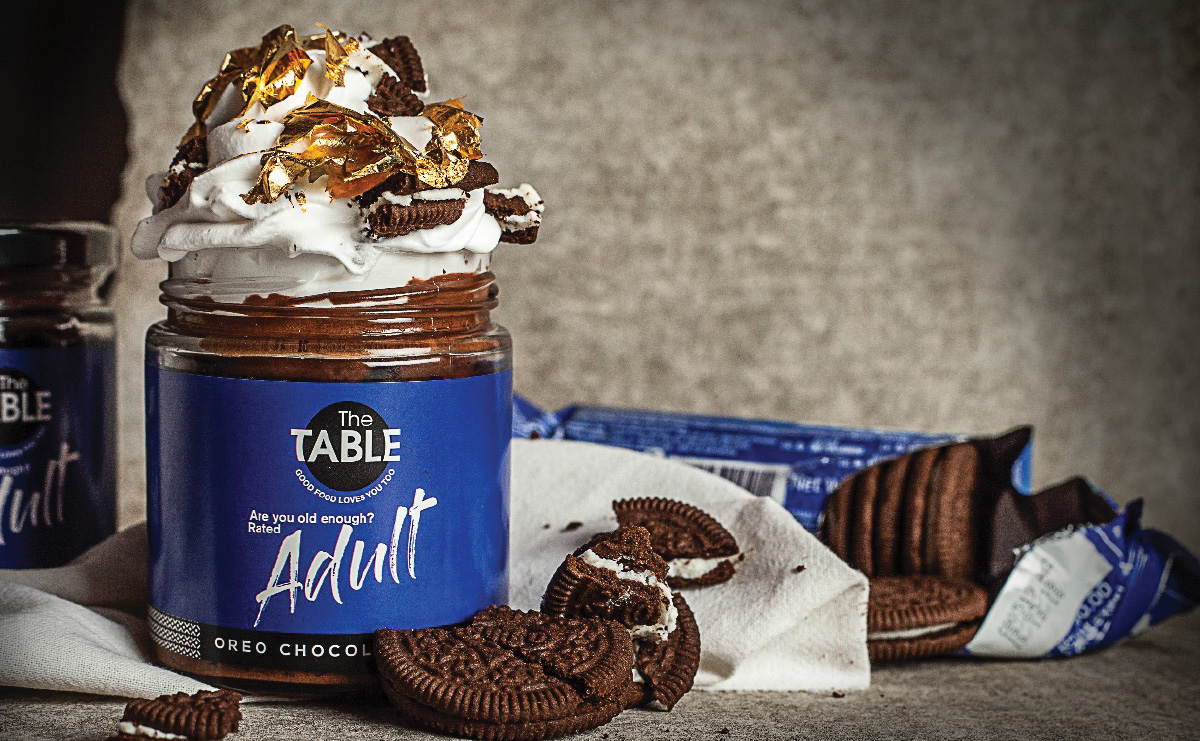
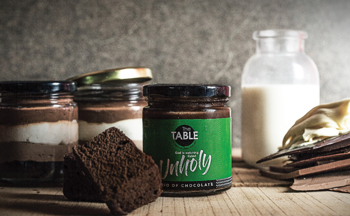
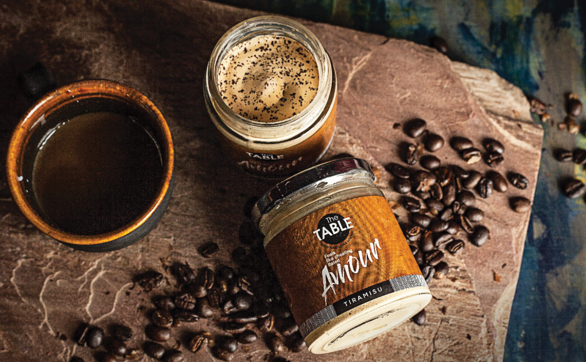
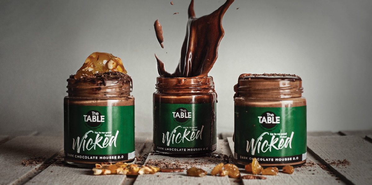
Packaging for the best-sellers was tough one. Looking at the menu sent each of us ordering in a lot more dessert than we would care to admit. Perhaps that’s what inspired the label designs, where each dessert was highlighted not just by name or ingredient, but by just how sinful it is.
